Global Development Insights Dashboard
Interactive dashboard visualizing global development insights using D3.js and modern web technologies.
Project Overview
The Global Development Insights Dashboard is an interactive data visualization platform that provides comprehensive insights into global development trends across different countries. The dashboard presents economic, social, and environmental indicators in an accessible and engaging format, allowing users to explore relationships between various development metrics.
This project aims to democratize access to global development data by transforming complex datasets into intuitive visualizations that reveal patterns, correlations, and disparities across regions. By making this information more accessible, the dashboard helps researchers, policymakers, educators, and curious individuals gain deeper insights into global development challenges and progress.
Technologies Used:
Key Features
Interactive Multi-dimensional Visualizations
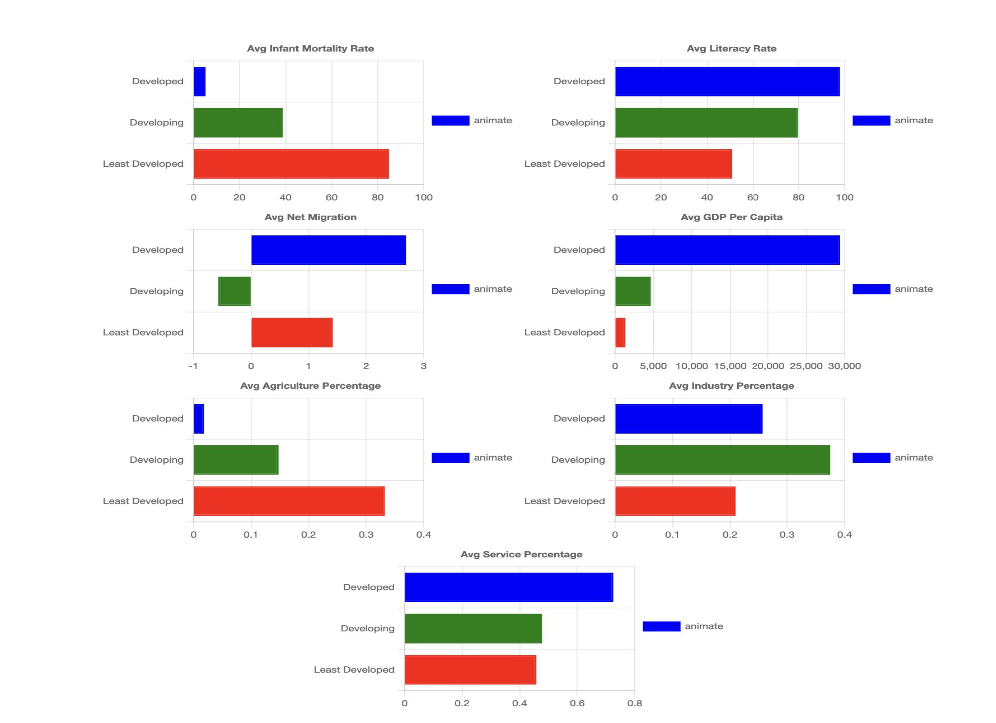
Dynamic visualizations that allow users to explore relationships between multiple development indicators simultaneously, including GDP, education levels, life expectancy, and more.
Customizable Data Exploration
Interactive controls that allow users to filter data by region, year range, development indicators, and other parameters to create personalized views of the data.
Advanced Visualization Techniques
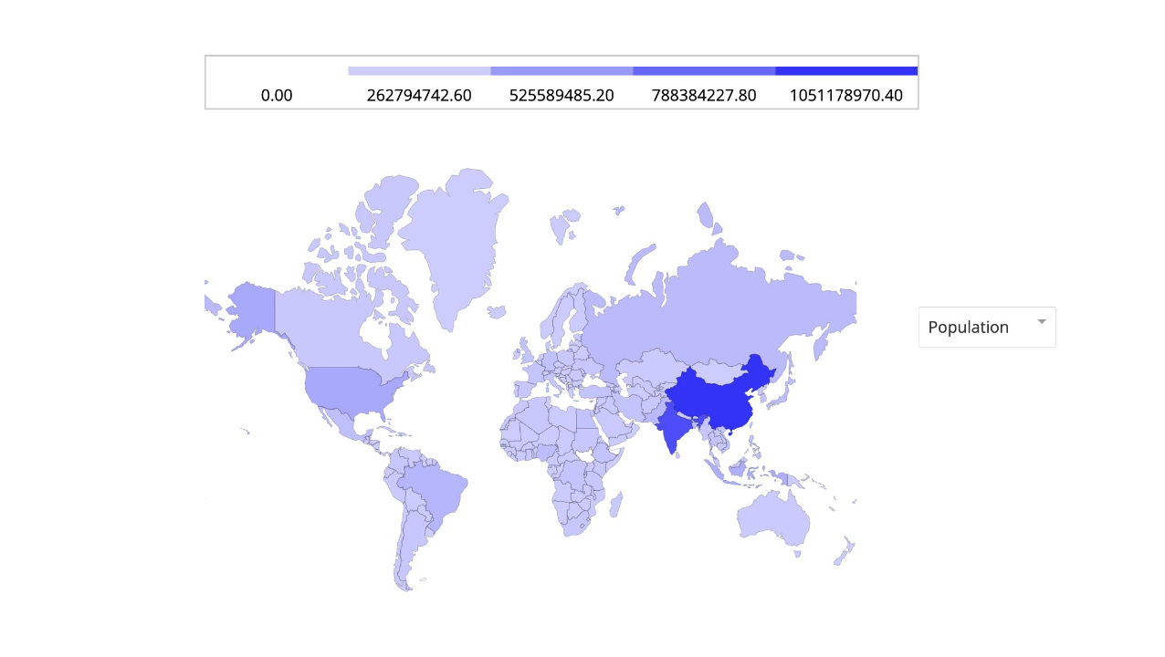
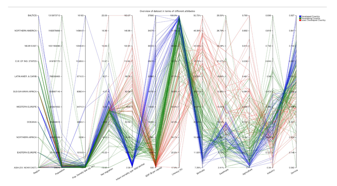
Implementation of sophisticated visualization methods including parallel coordinates, bubble charts, choropleth maps, and animated transitions to represent complex multi-dimensional data.
Contextual Information
Detailed tooltips, annotations, and supplementary information that provide context and explanation for the visualized data, helping users understand the significance of patterns and trends.
Project Workflow
Research & Data Collection
The project began with extensive research into global development indicators and existing visualization platforms. Data was collected from authoritative sources including the World Bank, United Nations, and other international organizations. The research phase included identifying key development metrics, understanding data structures, and planning appropriate visualization methods.
Data Preprocessing & Integration
Raw data from multiple sources was processed and integrated into a unified format. This involved cleaning inconsistent entries, handling missing values, standardizing country names and codes, and normalizing metrics for fair comparison. Special attention was given to temporal alignment of data from different sources to enable time-based analysis.
Dashboard Design & Architecture
A user-centered design approach guided the creation of wireframes and prototypes for the dashboard interface. The architecture was designed to be modular, with separate components for different visualization types and control elements. Emphasis was placed on creating an intuitive user experience that would make complex data accessible to users with varying levels of expertise.
Front-end Development
The dashboard was implemented using modern web technologies, with D3.js as the primary visualization library. The development phase included creating responsive layouts, building interactive visualization components, implementing filtering and search functionality, and optimizing for performance. Special attention was given to animation and transition effects to enhance user understanding of data changes.
Visualization Implementation
Multiple visualization types were implemented to represent different aspects of the data. These included parallel coordinates plots for multi-dimensional analysis, scatter plots with bubble sizing to show relationships between three variables, interactive maps for geographic distribution, and time-series charts for temporal trends. Each visualization was designed to be interactive, allowing users to explore the data in depth.
User Testing & Refinement
The dashboard underwent multiple rounds of user testing to identify usability issues and gather feedback. Tests were conducted with various user groups, including data scientists, policy researchers, and general users with an interest in global development. Feedback was used to refine the interface, enhance visualization clarity, and improve overall user experience.
Deployment & Documentation
The finalized dashboard was deployed as a web application, optimized for performance and accessibility. Comprehensive documentation was created, including user guides, technical documentation for future development, and explanatory content about the data sources and visualization methods used. The project was made open-source to encourage further development and adaptation by the community.
Project Gallery