Covid-19 Infection Rate Tracker
Interactive tracker to monitor and visualize COVID-19 infection rates across regions using real-time data.
Project Overview
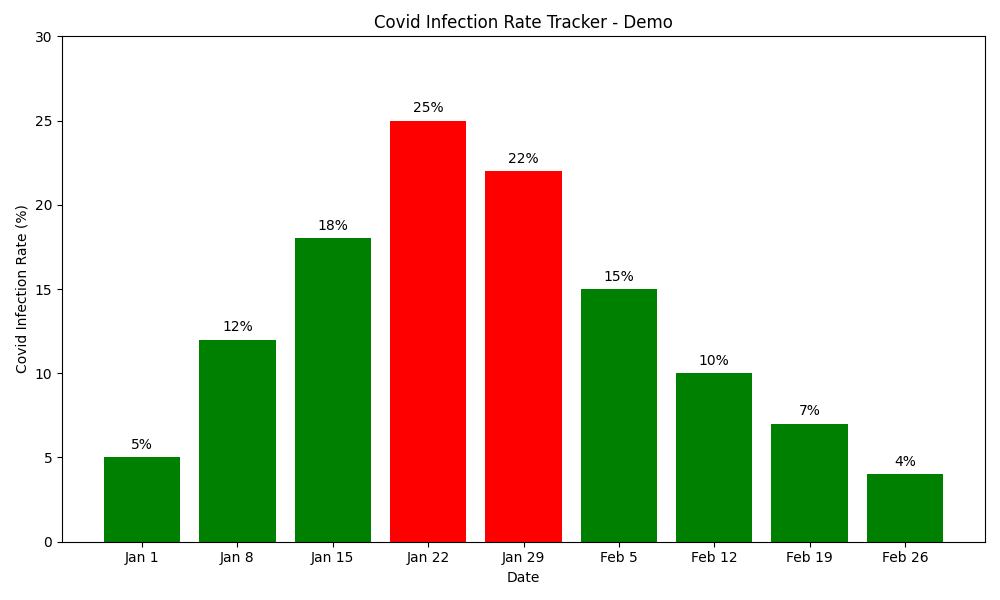
The Covid-19 Infection Rate Tracker is an application designed to help monitor the spread of COVID-19 infections across different regions. This tool provides real-time data visualization and tracking functionality to assist health officials, researchers, and the general public in understanding infection trends.
Developed as a response to the global pandemic, this project combines data analysis with interactive visualization to provide an accessible way to monitor COVID-19 trends. The system uses color-coded indicators to quickly identify high-risk areas and periods of concern.
Technologies Used:
Key Features
Real-time Data Visualization
Interactive charts and graphs that visualize COVID-19 infection rates, with automatic updates to reflect the latest data.
Region-based Tracking
Ability to monitor infection rates at different geographical levels, from global statistics down to local regions and communities.
Risk Level Indicators
Color-coded visualization system that highlights areas with high infection rates, making it easy to identify hotspots and concerning trends.
Historical Trend Analysis
Ability to view and analyze infection rate patterns over time, helping to identify trends and predict future developments.
Project Workflow
Data Collection & Integration
The system collects COVID-19 infection data from reliable public health sources and databases. APIs are utilized to fetch real-time statistics from trusted sources like Johns Hopkins University, WHO, and local health departments. The data includes confirmed cases, recovery rates, and fatality figures across different regions.
Data Processing & Standardization
Raw data is processed and standardized to ensure consistency across different regions and reporting methodologies. This includes normalizing population data to calculate infection rates per capita, handling missing values, and applying statistical methods to smooth out reporting inconsistencies that might affect the visualization.
Data Visualization Development
The processed data is transformed into interactive visualizations that make the information accessible and meaningful. Various visualization techniques are employed, including time-series graphs, color-coded maps, and comparative charts. The system uses color-coding (green for low risk, red for high risk) to provide immediate visual cues about infection severity.
User Interface Implementation
A user-friendly interface is developed to allow easy navigation through the data. The UI includes search functionality to find specific regions, filtering options to view data by different metrics, and date range selectors to analyze historical trends. The responsive design ensures usability across different devices and screen sizes.
Automated Update System
An automated system is implemented to regularly update the data with the latest information. This ensures that users always have access to current statistics. The update frequency is configurable, with options for daily, hourly, or real-time updates depending on data source availability and user needs.
Deployment & Accessibility
The final application is deployed as both a web-based dashboard and a downloadable application. This dual deployment approach ensures maximum accessibility, allowing users to access the tracker from any internet-connected device or to use it offline with periodic data updates.